Fortis is fully responsive theme with dozens of features and hundreds of customization possibilities, suitable for every type of products. It was designed with focus on user experience and usability, to make shopping quick, easy and fun.
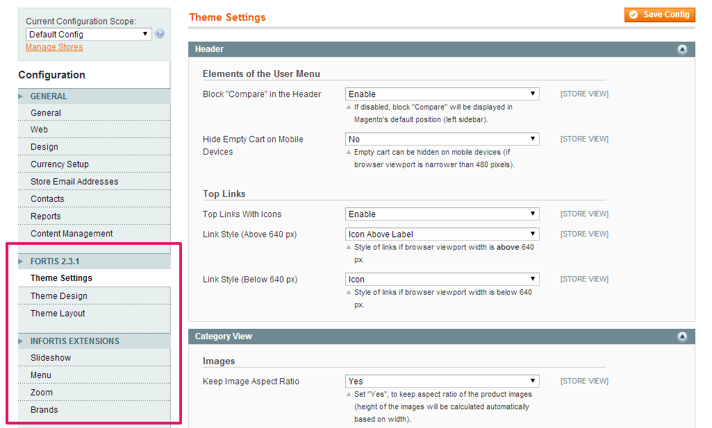
You have never seen so many options – powerful admin panel allows you to customize the theme without even touching CSS.
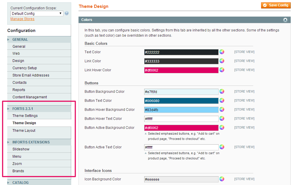
You can change the visual appearance of almost every element of the theme. You can change colors using color pickers, apply patterns/textures (predefined or custom) for header, footer and for the entire page, upload background images and configure their properties (position, repeating, attachment), change font style and font size, and many many more…
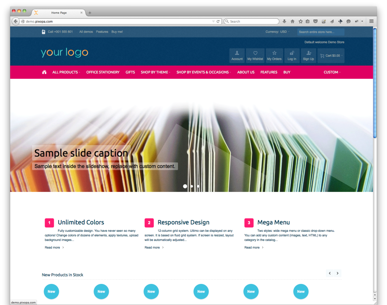
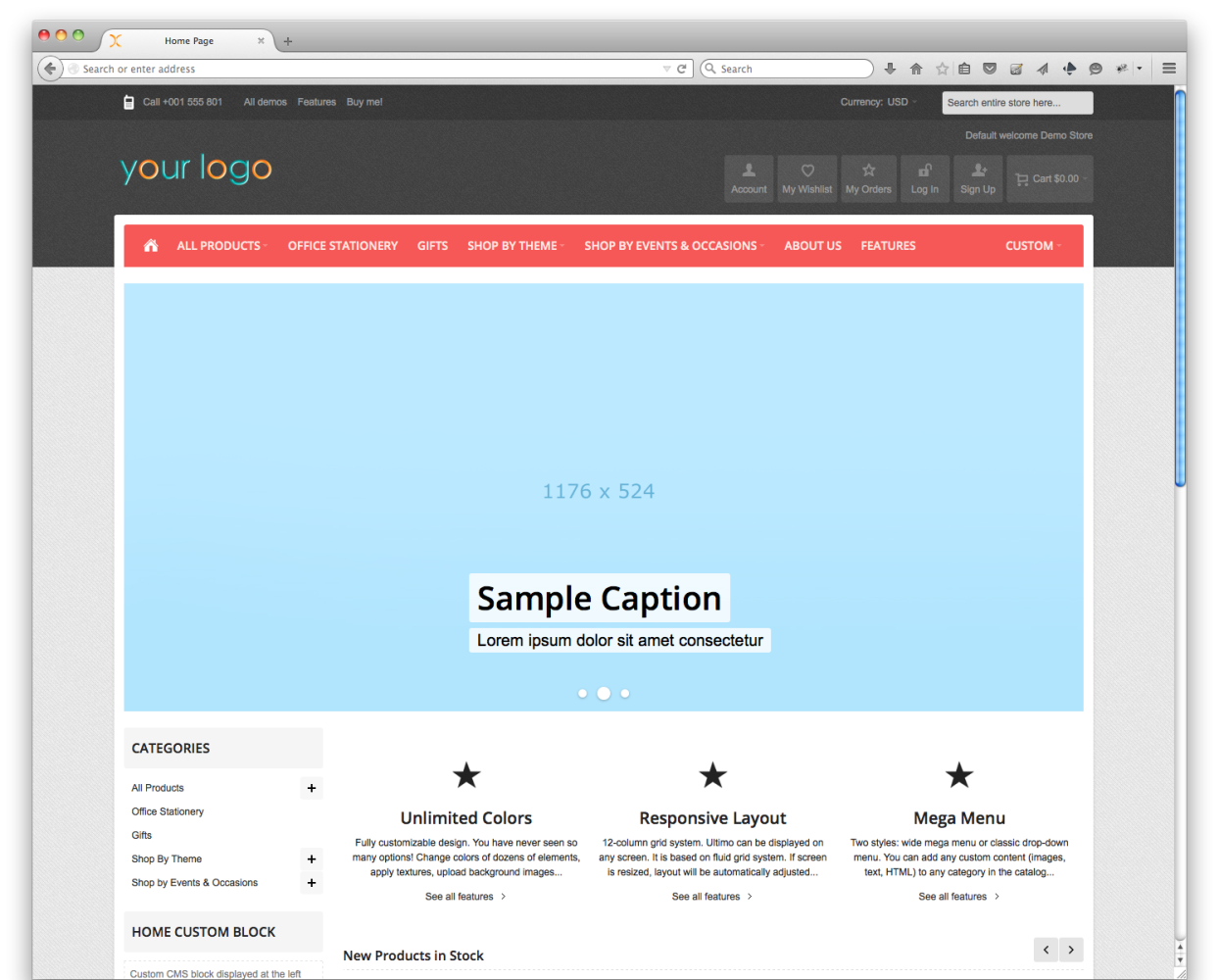
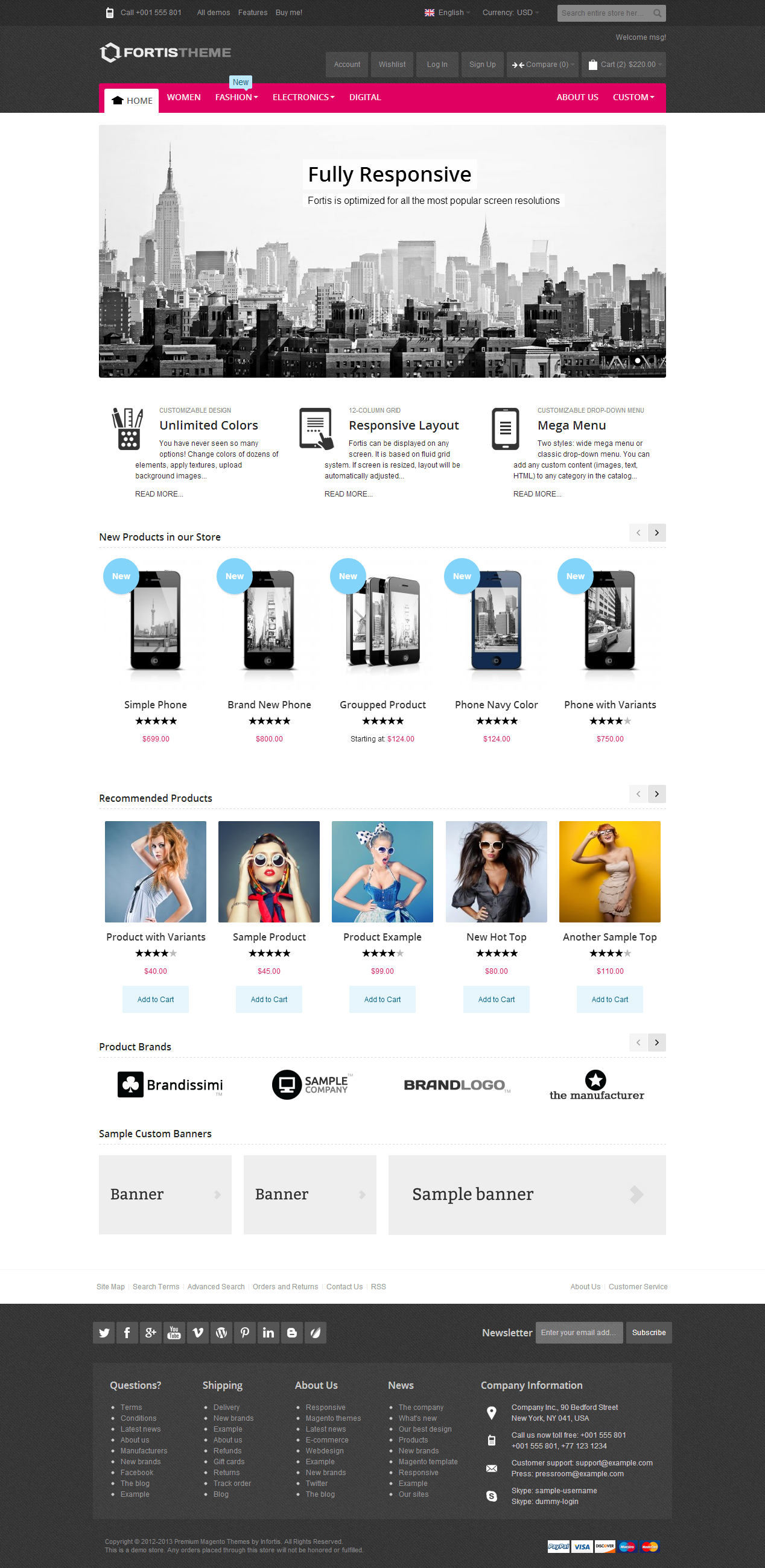
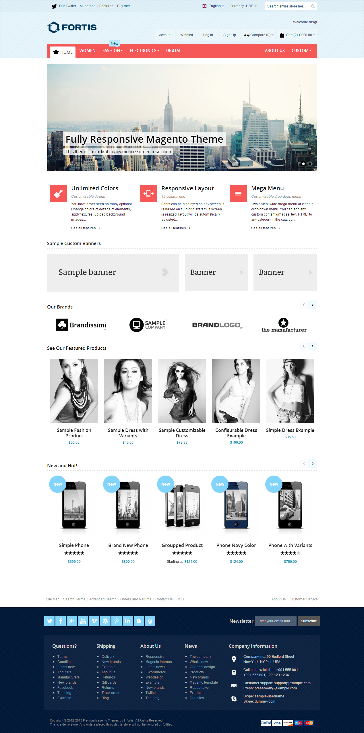
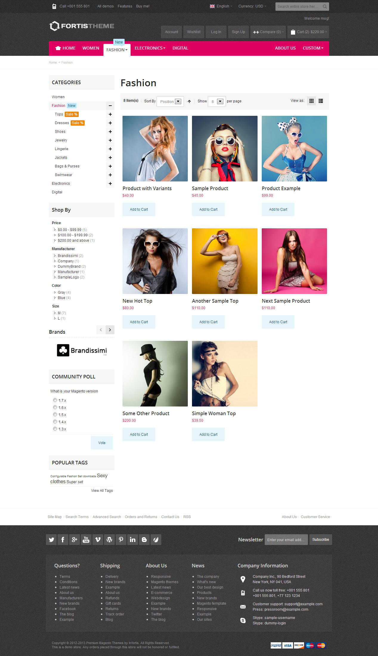
Fortis Theme Screenshots
DESIGN
Customizable design
Change the visual appearance of almost every element
Unlimited colors
Change colors of dozens of elements, apply textures, upload custom background images
Google Fonts
Integration with all available Google Fonts
Custom font stack
Ability to select standard web-safe fonts (e.g. Arial, Verdana) or define custom font stack (e.g.: Arial, “Helvetica Neue”, Helvetica, sans-serif)
LAYOUT
Customizable responsive layout
Custom maximum width of the page, supports wide screens
Fluid grid system (12-column)
The theme always uses maximum available width of the screen to display content. It can be displayed on any screen. Fluid width can be disabled
MEGA MENU
2 menu styles
Wide mega menu or classic drop-down menu
Custom content blocks
Add any content (images, text, HTML) inside category drop-down menu, for every 1st-level and 2nd-level category
Custom links
Display custom links in the main menu bar
Customizable size
Adjust number of columns inside drop-down menu
Accordion (mobile menu)
On mobile devices the menu turns into collapsible accordion. Set the value of the web browser wievport width below which the menu turns into accordion
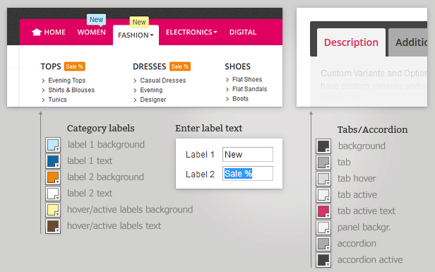
Category labels
Eye-catching labels for categories (customizable colors ant text)
Sidebar menu
Display menu (categories) in the sidebars and in any custom block
Fully customizable colors
CATEGORY VIEW
Fluid products grid
Display from 2 to 7 columns of products on category pages. On wide screens the number of columns will be automatically increased to show more products in a row
Customizable grid
Configure the display of the following elements (they can be visible, visible only on mouse hover, or completely removed): “Add to cart” button, ratings (stars), “Add to wishlist” and “Add to compare” links
Alternative images
Show alternative product image on mouse hover in category view and in product sliders
Equal height
Equal height of items in the category grid (can be enabled/disabled)
Keep the aspect ratio
Keep the aspect ratio of product images (upload images of any dimensions, not necessarily square)
List of categories
Menu at the top of the left sidebar. It can be hidden on mobile devices. List of categories can also be displayed in CMS blocks and on CMS pages
PRODUCT PAGE
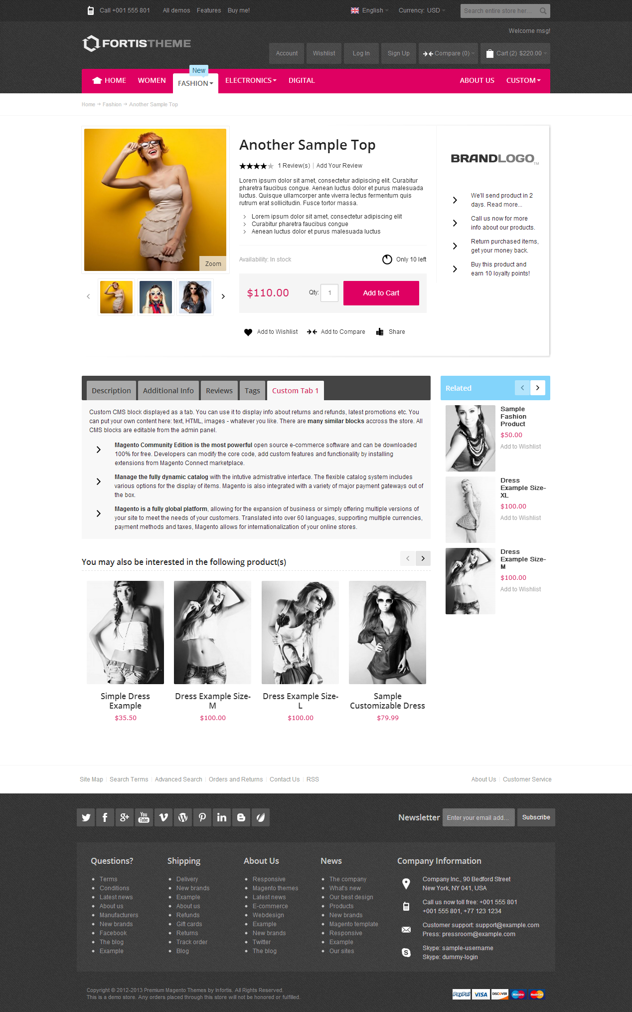
Clean and readable product page – your customers can easily find all important information. Prominent brand logo, customizable product options, sliders for related and up-sell products, custom tabs and CMS blocks, social bookmarks, resizable image zoom etc. Adjust product page to your needs.
Brand logo
Brand logo on product page. Logo can be a link to any page (to category with products from that brand, to search results or to any CMS page). Alternatively brand names (simple text) can be displayed instead of logo images
Customizable image size
Customizable image size on product page. Specify any size you like, images don’t have to be square – you can keep the aspect ratio
Cloud Zoom + Lightbox
Cloud Zoom + Lightbox to enlarge product images. Use one of those methods or both at a time
Image gallery
Enable/disable gallery mode in the Lightbox (previous/next image)
Tabs/accordion
Tabs smoothly turns into accordion on lower screen resolutions
“Additional Information” tab for individual product attributes
Create and display custom product attributes
2 tabs for custom content
Ready to display any static content: info about shipping, returns, sales, promotions or any other general information
Tabbed reviews
Show product reviews on product page to improve SEO
Replace Related Products and Up-sell Products
Blocks with custom content. Replace completely or replace only if the product does not have any related/up-sell products. Or disable those blocks completely with just one click
Product sliders
Product sliders for Up-sell Products and Related Products. Now you can select as much related and up-sell products as you want
HOME PAGE
Home page slideshow
Fully customizable, easy to use. “Slide” or “fade” effect, 30 easing methods, editable speed of movement and speed of transition and much more. Display any content in your slides (clickable or non-clickable images, complex HTML, anything), add captions above images
Slideshow + banners
Additional banners (can be disabled) at the right or left side of the slideshow.
Hide slideshow on mobiles
Ability to hide slideshow or slideshow banners on mobile devices
1, 2, 3 columns layout
You can choose the layout of the home page: 1, 2 or 3 columns. Display custom content in multiple sidebar blocks. Enable/disable default sidebar blocks on home page.)
List of categories
Display block with the list of all categories in one of the sidebars
Brand slider
Present all brands on the home page (or on any other CMS page or sidebar block)
“Featured Products” slider
Display selected products on any page. Configure the number of products, number of columns (visible products), scrolling speed, automatic or manual scrolling, number of products that should move on animation. Ability to hide “Add to cart” buttons
“New Products” slider
Automatically display products marked as “new”. Configure the number of products, scrolling speed, automatic or manual scrolling
Sliders on any page
fully customized sliders can be displayed on any CMS page and inside custom blocks
Multiple sliders
Display multiple “Featured Products” sliders on a single page
Random products
Display random products in the “Featured Products” sliders
Product sliders
Display columns of custom banners using fluid grid system
CMS
One-click import
Import CMS blocks and pages with sample content from the demo
50+ CMS blocks
Content placeholders (also called custom blocks) ready to display custom content in almost every part of the store. Using these placeholders you are able to insert your content into product page, shopping cart, checkout, header, footer, CMS pages etc. Everything edited from the admin panel
Large footer block
Large footer block with 2 rows of columns (from 1 to 6 columns in a row) for custom content. Put there your links, latest news or any other content
Social services bookmarks
Social services bookmarks can be easily placed on the product page using one of the CMS blocks
OTHER
“New” and “Sale” labels
Mark your products with eye-catching labels. Text on the labels can be translated
Override default header and footer links
If links are hard-coded, with this theme you can easily replace them with your custom links!
General Info
200-pages user guide PDF
The best theme documentation with extensive details
Multi-language ready
This theme can work with any language installed in your system
Multi-store ready
Applicable for multi-store installations. Please note that in multi-domain installations multiple licenses are required (one license per domain)
Performance
Images are merged into CSS sprites. This method is proven to greatly reduce the amount of HTTP request and significantly improve page load time
Optimized, well-structured and commented CSS
PSD files included (with basic layout structure + all interface icons for easy customization)

